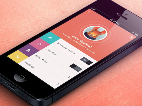
As in case of fashion, UI design trends also tend to change from time to time. Styles like skeumorphism, accordions, flat designs come and go, and also return from time to time. Most internet users have started using their mobile phones to gain access to the web. As a UX designer, if you follow the latest trends, you will find that majority of internet users are not aware of the actual difference between a responsive site and a mobile dedicated site. Mobile sites that come with poor visibility are not considered to be mobile optimized.
From the user’s point of view, you will find that implementation of a site doesn’t matter. Mobile dedicated as well as responsible websites need to follow the same rules.Though few people argue that feature parity and content distinguishes responsive websites from mobile dedicated ones, it is not always true.
There are some responsive sites that do not have all the features or content available in desktops, and at the same time there are mobile sets that have feature parity and content. In case of some sites, content and feature parity is suitable while in case of others ensuring smooth mobile experience is possible through minimizing content and features.
Actual difference between responsive web design and a mobile dedicated one is at the level of strategy and implementation. Responsive websites have a clear cut content repository and combined strategy. So, there is no sense hosting the same content elsewhere. Most of the time, responsive web design starts with mobile specific design. As a result, there has been an increased awareness of fundamental principles of mobile-usability principles. Though these principles are quite old, yet their significance has grown as responsive web design has gained popularity.
If you follow existing trends, then you will find that most companies are focusing on providing a good mobile experience to users. Another point that you need to take into account is the fact that content needs to be prioritized over chrome for mobile. So, as a UI designer you need to prioritize content for mobile based internet users.
Though responsive web design has helped to enhance mobile usability, it is not always necessary that responsive sites can be used on mobile. responsive web design has also made some bad effects on mobile usability, especially in the case of super long page. Mobile based internet users scroll through these pages only when they need to.
However, there are a number ways to fix the problem. Long mobile pages go well with according, back-to-top buttons, and sticky navigation. Most of these sites make use of these constructs. Another point that you should keep in mind is the fact that layering of mobile content is essential. You don’t need to cut or hide it, but rather prioritize its gist and defer its details to secondary pages. You also need to learn to fit your desktop based, deep information architecture into 2-level navigation which can be used on mobile. This is because deep information architecture often doesn’t work well with mobile and forces the user to take lengthy steps to find out the content.
For More information Visit:Genesis Software Solutions, Inc.

