

There are different reasons why we should choose WordPress. It comes with plenty of advantages. WordPress is free and there are different ways we can use it. There are thousands of themes and plugins that we can use for our WordPress blogs. We could define our WordPress blog based on the number of columns, subject, color and many other parameters. Our WordPress blog can be enhanced based on our individual purpose and taste. By choosing the correct layout, we could attract more visitors and our information will be more easily distributed to others.
One of the major concerns when building our WordPress website is that a big part of our visitors will come through mobile devices. This is an unavoidable fact, because browsing the web using mobile devices can be more convenient than with laptops or desktop computers. In this case, we should make sure that our WordPress blog will be able to be displayed properly on mobile devices. The plain vanilla theme that we get when we first install WordPress could be perfectly displayed on mobile devices with its simple and straightforward layout.
However, once we install complex theme and fully-featured plugins, there’s no guarantee that mobile devices will be able to display them properly. Some widgets with their pretty representation won’t appear well or may not appear at all on mobile web browser. If our website relies on non-mobile friendly themes, plugins and widgets; we could lose a lot of potential visitors or worse, customers. When building our website, we should make sure that it would work well on both standard computers and mobile devices.
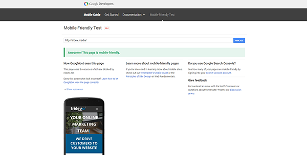
We should be sure that mobile users are able to access many parts of our website easily. If we don’t do that, they could prefer to read information or buy products from competitors with websites that are optimized for mobile devices. This is obviously not good thing. Fortunately, there are already many WordPress themes that promise good mobile compatibility. We should prioritize on choosing these themes. After activating a supposedly mobile-friendly theme, we should immediately verify it.
There are many useful WordPress themes that can make our website more accessible to others. In general, it is a good idea to choose a theme that is initially adapted for mobile devices and then adapted to look good on PC. If we are able to obtain this kind of theme, it’s like killing a couple of birds with a single stone. Best of all, many of these dual-purpose themes are available for free. There are hundreds if not thousands of WordPress themes that are fully tested to work on Android and iOS devices.
Other than testing the theme on smartphones, we should also make sure that these themes could also work well on tablets. Unfortunately, mobile devices have many different screen resolutions and we should make sure that these themes work well on less common screen sizes and resolutions. Some mobile users could still be using very small devices with 3.5-inch display, so we should test on them as well.