

Common pitfalls, you need to learn to avoid, while creating an impressive church website. They are simple but essential to remember.
- Expensive is not excellent
- Bigger is not superior
- Flashier is not appealing
Elements to be included in a church website
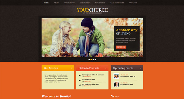
Graphics and visuals
Graphics are really crucial because it give visitors an idea about the church, instantly. For example, colors affect the emotions of the viewer positively or negatively. Graphics comprises of background images, color scheme, font size, font face, logo, layout and more. Font size and face is also important as readability aspect to find information.
Expert designers incorporate rotating banner of pictures, which give a spectacular graphical interface. A church website has to look awesome using the law of visual. You can build church websites at sharefaith.com.
Avoid stuffing your site with plenty of pictures or graphics because more is not fine. Therefore be choosy about the graphics and use the best ones.
Obvious navigation feature
Navigation links needs to be positioned clearly on the page. Main navigation links need to be on top left just like on Google.com. The first factor to determine for awesome navigation is obvious layout.
User-friendly factor is the other factor to be considered for remarkable navigation. Navigation labels must not be trendy or fancy you can lose the interest of visitors. Simple directions like ‘Directions’ and ‘About Us’ are fine.
In the end, the link button looks and text is vital. The navigation elements need to be large enough as well as obvious, so visitors can find them easily without having to hunt them. Navigation items need to be staring readers in the face from every page of the site.
Maintain simplicity
For maintaining simplicity, keep plenty of white space. White space means the absence or presence of texture or color but nonappearance of elements like graphics, text, etc. just look at Google.com that includes plenty of white space. Page simplicity helps to clearly know, where to click.
Secondly, never include anything extraneous but add something that is actually helpful to users. Cluttering the site with information that is not helpful means sabotaging the reliability of the website, so be careful.
Staff names & titles
Viewers of your church website may visit your church and not the members. Therefore post names & titles of the staff instead of the members. This will help them to have some reference of the staff they will meet, when they visit the church. It is recommended to include a picture of the staff because it helps to contact the staff directly.
Information about child and youth ministry
Church website is a fascia of the place of worship, therefore ensure that parent know what to anticipate, when they arrive with their youth or kids. Generally, they need to be assured that their kids are in safe hands and well-cared at the church.
Inform them about the activities their kids will experience on Sunday morning, in advance. What is preached on Sunday mornings is very much importance. Post audio sermons online to inform interested visitors, who can benefit or are not capable to visit each week service.