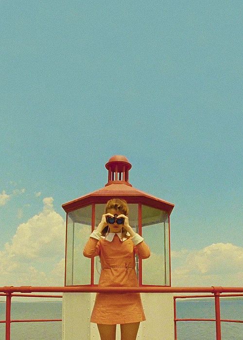
A widely recognized photographer, Ansel Adams, once said “You don’t take a photograph, you make it”. A thousand photographers can shoot a single subject, and the end results will be thousand of completely different images. It is the same with movie directors. Some of them are so unique we would recognize their style from a single frame.
“You don’t take a photograph, you make it”
One of them is Wes Anderson. The ways he can capture a shot, compose an image, or dress up his sets and characters can be a lesson not just for filmmakers, but for photographers, too. Here are 5 lessons you can learn from him.
Technical Precision
This is the most noticeable identifying feature of Wes Anderson’s work. The chops he makes behind the camera can immediately give away any film as his. Not a single frame in his movies is left to chance. The movements of camera are carefully thought trough. Many of his coworkers and fans have described his work as unmistakable, and for a good reason, too. The scenes in Anderson’s movies seem as if they are pages of a ‘pop-up book’ carved precisely into perfection. What you, as a photographer, can learn from him, in this aspect, is that, before you snap your camera, you have to think about the outcome.
Moving with the Subject
One of Anderson’s most widely used weapons from technical arsenal is the tracking shot. He puts the camera on the rails and let it glide, from right to left, left to right and backwards. This technique creates energy and movement. The moving along with the subject is what adds liveliness to even the most depressing Anderson’s films. Though you cannot imitate this technique completely with photography, you can, however, realize the importance of moving with your subject, instead of just standing and waiting for it to move.
Using the Symmetry
If you take a close look to Anderson’s movies from Bottle Rocket and Rushmore, you will see signs of deep-rooted love for symmetry. If you, however, observe everything from the Royal Tenenbaums and after, it can be seen how that love for symmetry has become even more prevalent. It can be seen in every part of the scene, from how the characters are placed in a frame to the reciprocal arrangement of props in front of the camera. Arranging the subjects of the photograph in symmetry can add more drama to the photo.
A Breath of Nostalgia
Anderson’s love for the bygone times is very obvious in all of his works. The two most significant examples of how the soft spot for the past shapes Anderson’s plots and appearance of his scenes are The Grand Budapest Hotel and Moonrise Kingdom. The longing for out-of-date times, objects and peoples is reflected in the specific mood which can be accomplished with yellowish, muted and sumptuous hues. Similar specifically nostalgic and sad images are possible to get with lens filters or in post processing.
Patterning and Bursts of Color
Colors and patterns are characters for themselves in Anderson’s movies. They can affect the entire mood of a specific scene and change the way how we understand it. You can notice that by looking at the patterns on the furniture in the hotel’s lobby in Grand Budapest Hotel, the carpet on the floor in the Tenenbaum’s house in Royal Tenenbaums and the red apples decorating Felicity Fox’s dress in Fantastic Mr. Fox. What every photographer should learn from Anderson is to use colors and patterns, not just as backgrounds, but as means for creating a more appealing image.
For the end, wise words from the man himself: “That’s the kind of movie that I like to make, where there is an invented reality and the audience is going to go someplace where hopefully they’ve never been before.” Go out there and make that kind of photo.

