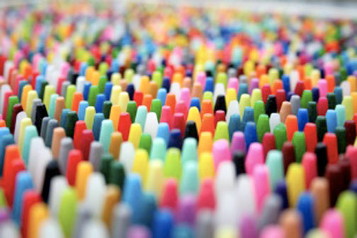
Color can be a driving force behind every choice you make, whether you’re customizing the company’s t-shirts for the annual run or deciding on which new purse to buy. You probably already know some of the basic “color rules”, but do you use them wisely to create change in your life? Do you know why you have a “favorite color” or why there’s nary a single orange shirt in your closet? Tap into the full power of the rainbow with every decision you make.
Color is a choice that’s almost always available, whether you’re buying a car or shopping for storage equipment for your home. However, you probably find yourself going with the same hue over and over again. Maybe you cling to neutrality because you don’t want to make a choice or deal with complex color coordination. Here are a few common color rules and how to apply them to your life:
- Red
Red stands for passion, ambition, anger or generally being all fired up whether that’s a good thing or a bad thing. According to Shape and numerous studies, men love the color red in general, including on women, which is why it’s a staple color for dates. You may also want to use it when it complements an advertising campaign, to “warm up” a high energy room or when you need to exude power.
- Blue
Blue is a cool tone that, depending on the specific hue, can be rejuvenating, relaxing and calming. It’s why you’ll find so many hospital walls featuring blues and greens, and it’s also why it’s so popular in tropical beach hotels (everyone wants to feel cooler after a day at the beach).
- Beiges
There’s a reason why Elle Décor has named beige the color trend of the moment: it’s not a trend at all. Neutrals like beiges and grays are great for covering large areas because they don’t drum up any particular feelings. However, they’re a great backdrop for pops of color, so you can pepper in colorful lamps, rugs or pillow that are easy and cheap to change up with your moods.
- Yellow
Yellows can be bright and sizzling (though still not as “hot” as red) or subdued and pastel, which lends a warm and hospitable vibe. Yellows aren’t generally intimidating, and they’re more like the girlish, sweet cousin to the grown up fiery red. They’re a little safer, don’t make as big of a statement, but still welcoming.
- Purples
Lavenders are the ultimate warm, cross-gender hue. It’s a jewel tone that’s warm, but in a darker way (kind of like Angelina Jolie). They’re one of the few warm tones that can cross gender barriers. Deep purples are linked to royalty, and bright purples are like the alternative cousin to reds.
No matter which hue you prefer, tap into its power to maximize the results you’re after.

